UX/UI Case Study

Designing trust for a local veterinary clinic

A small veterinary clinic in Tenerife wanted to go digital. Not to become a big e-commerce platform. Just to reach more people without losing what made them special.

Veterinary Clinic UX/UI Design Trust Design E-commerce
Hero visual from the veterinary clinic UX/UI case study.

Project Context

Going digital without becoming generic

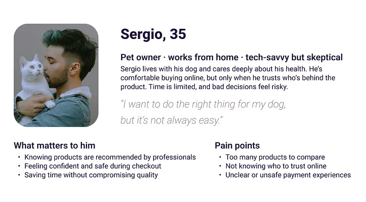
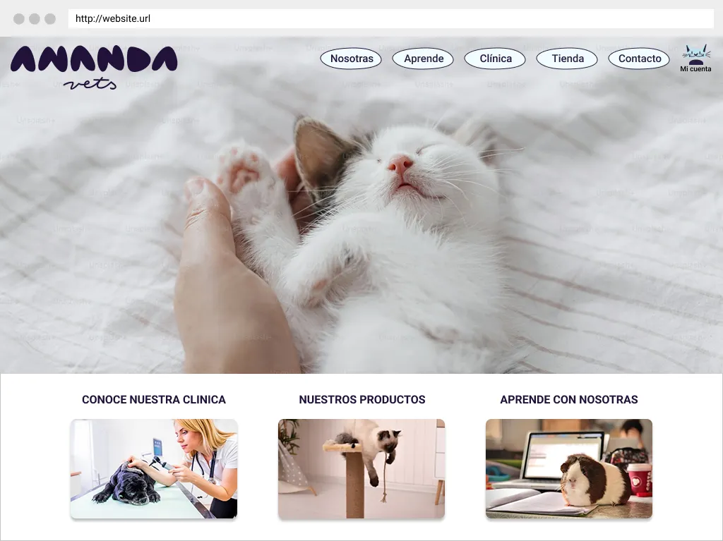
They are a neighborhood clinic, built on proximity, care and long-term relationships with their clients and their animals. Going online meant selling products, but also translating that sense of trust into a screen.

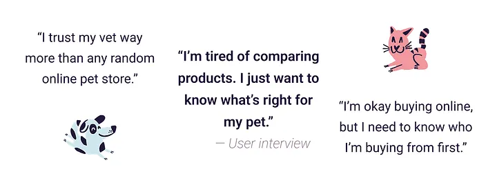
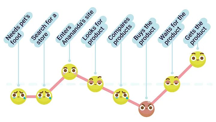
Buying products for pets is never neutral. People hesitate. They compare. They worry. They want to be sure they’re doing the right thing.

During research, one idea appeared again and again: pet owners trust veterinarians far more than generic online stores. Many don’t have time to visit the clinic as often as they’d like, but they also feel uneasy buying from faceless platforms.

Context image from the veterinary clinic digital experience.

Research Insight

The project stopped being about selling products

So the project stopped being about selling products. It became about designing reassurance. How can a website feel like your vet?

Research and trust framing visual from the veterinary clinic case study.

Audience & Journey

Designing for care, skepticism, and busy lives

We designed for people who genuinely care about their animals but live busy lives. People who are comfortable online, yet skeptical. They don’t want endless options or aggressive sales tactics. They want clarity, guidance and calm decisions.

Mapping the full journey helped us understand where anxiety appears. It often starts during comparison, grows during payment, and lingers while waiting for delivery. Every step could either reduce stress or increase doubt.

Audience and journey mapping visual for the veterinary clinic project.

Information Structure

Structure first, before visual style

Before touching visual design, we focused on structure. Clinic, shop and educational content needed to coexist naturally. The experience had to feel familiar, predictable and easy to navigate.

Low-fidelity wireframes allowed us to remove friction early. No visuals, no branding. Just hierarchy, flow and clarity.

With mid-fidelity designs, we introduced what users had been asking for all along: clear recommendations, familiar payment methods, and language that felt honest rather than promotional. Usability testing confirmed it: when users feel guided instead of pushed, confidence grows.

Structure and low-fidelity wireframe visual from the veterinary clinic case study.
Additional wireframe and structure image from the veterinary clinic case study.

Mid-Fidelity Decisions

Trust grows when users feel guided, not pushed

The final design is warm, simple and human. It avoids aggressive calls to action and focuses on trust, proximity and professionalism. It doesn’t try to replace the physical clinic. It extends it.

Designing this project reinforced a simple idea: trust isn’t something you add at the end. It’s something you build quietly, through every decision.

Designing for care means designing for trust.

Mid-fidelity and trust-signals visual from the veterinary clinic case study.
Final trust-focused interface visual from the veterinary clinic case study.

How This Fits

How this fits in my UX/UI work

This project reflects my approach to UX/UI design: starting from real human concerns, using research to guide decisions, and designing experiences that feel calm, honest and meaningful.

Closing visual from the veterinary clinic UX/UI case study.

More Work

View more work and explore the rest of the case study library.

View more work